Tuesday, December 14, 2010

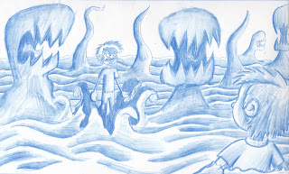
Pencil Renders


Pencil renders done with blue Col-Erase. Love those pencils; it's like a pen and a brush in one!

Friday, December 10, 2010

New layouts for scene 1


This is a new shot I created to take place after Chris gets pulled down by the shadows. We'll see his teddy bear fall and then zoom into the bear's eye. From there we'll see him getting pulled toward the beast. 

Monday, November 15, 2010

Layout for Scene 1-1


Line drawing for my layout of Scene 1-1. Took about 3 hours to draw...maybe I can play around with some Maya shaders. Until then, it's by hand.

Tuesday, November 9, 2010

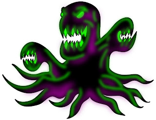
Rendered Characters: Healthy Chris, Sick Chris, and the Cancer


I rendered all three in Photoshop with the shadows and highlights that I plan to use in the film. Gotta work on sick Chris, but I like how healthy Chris and the cancer turned out.

Shot 1-10: Lighting Test


The lighting test came out better than expected. I'm also quite pleased with the cancer's shadow.

Thursday, November 4, 2010

Concept Art


More concept drawings. I feel like I've finally nailed down Chris' design.

Wednesday, November 3, 2010

New Shots Added


As if I don't already have enough on my plate, here I am adding more shots to my thesis. This is for the best, I swear, as I feel that it helps keep up the pace.
I also made another concept drawing for Chris. I like the pose, but feel that his legs are too long. Well, back to the drawing board.


Friday, October 29, 2010

Chris concept drawing


It's been a while since my last post. Rest assured that I am knee-deep in the trenches of rough animation. Though I'm making progress, I will not post any more rough animation until I am proud of it completely.

Till then, enjoy the concept art that I will post in the near future.

Saturday, September 25, 2010

Tuesday, September 21, 2010

Logo


A logo I created for my Masters Thesis 1 class. I kind of like it; maybe I'll put it on a t-shirt.

Monday, September 20, 2010

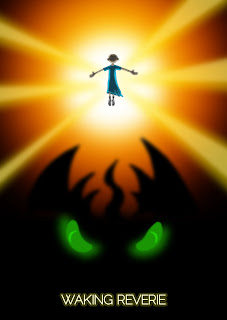
Movie Poster 2.0


My second stab at making a poster. I like this one much better.

Sunday, September 19, 2010

Fully Rendered Frame, 1-12


Another rendered frame, this one is from 1-12. People were telling me that the early frame I posted didn't have a high enough contrast. I'm really diggin' the black, green, purple for the cancer.

Friday, September 17, 2010

Fully rendered frame, 1-4


This is a fully rendered frame at 1920 x 1080, at 300 dpi. More to come...

Wednesday, September 15, 2010

Movie Poster


This is my first stab at a movie poster. Turned out better than I had hoped.

Wednesday, September 8, 2010

Rough Animation WR 1-5


Here is some rough animation of scene 1-5. I've decided to do the rough animation on a cintiq using Photoshop CS4's animation preset and then doing the clean-up on traditional animation bond paper.

This way I get the best of both worlds. I can make all the mistakes I want on the computer, and I get the draftsmanship of traditional drawing.

Wednesday, September 1, 2010

Shot list


Just finished my updated shot list. I divided each spot and then ranked them on priority to the overall project, the amount of difficulty it would be to animate them, and finally by how long it will take.

Blues are fast and easy, reds are hard and slow.

Friday, August 27, 2010

Abstract art using After Effects

Made the same way as with the photoshop abstracts, plus a few After Effects filters. I like the fiery one.


Thursday, August 26, 2010

Abstract art created in Photoshop


Hear are ten abstracts I created in photoshop, using lens flairs and various filters. These will more than likely be in the background to better set the mood of the nightmare.


Saturday, August 21, 2010

Near Final Animatic


Took me a while but I think I've finally got it the way I want it.

Tuesday, July 13, 2010

Concept Art: Gotcha


More concept art of Chris in the labyrinth. I've been playing around with the tone for the cancer-beast; this time I just used invert. I like the effect of the white lines on black, though I still need to work on the chiaroscuro.

Monday, July 12, 2010

Concept Art: Trapped


More concept art of Chris in the labyrinth. I'm liking the tone on the cancer-beast but think that it may be too detailed for this project.

Tuesday, July 6, 2010

Concept Art: Labyrinth


Here is concept art of Chris being chased by the cancer through the labyrinth of his nightmare. Special thanks to Jessie Carson for letting me borrow his Cintiq; it makes coloring sooo much more fun.

Wednesday, June 30, 2010

Concept Art: Chris


Here is my color comp for the character of Chris. I used the same colors on both versions of him, only I over-saturated the one of the left and under-saturated the one on the right.

Monday, June 14, 2010

MFA Thesis Proposal

I had my Master's thesis committee review last week and things went quite well; they wanted me to change some things here and there but nothing I can't handle. Below are the actual slides from my presentation.